Reports – Create, Share, Request and more!
Easily create your reports with the ClayHR report designer. To begin with, please navigate to the “Analytics” –>“Reports” ->“New Report”.
Some of the features provided are as follows:

Send a report to a group of people, along with an optional message.

To make the report a favorite, click the icon. From the report home page, you can easily navigate to this report.

Print the report.
Refresh the report data.
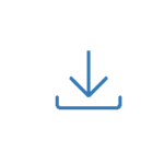
You can easily download the report in a variety of formats, including CSV and Excel, along with the filters you’ve chosen.

Click the edit icon to add any columns, filters, or access to the report, as well as to make it a scheduled report.

Toggle full-screen mode to make it easier to read and analyze the data.
Follow the guidelines for creating a report:
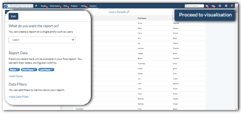
- Give your report a “Title” and choose a “Section” where it will appear. Then go ahead and proceed with that.
- A screen will appear where you can design and add columns.
- On the top left, you will be able to see some options from where you can choose.
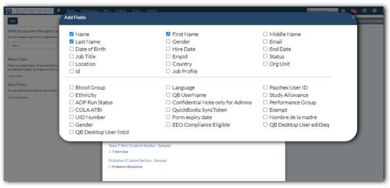
- Select the “Entity” such as users, goals, timecards after that next step is to “Add fields” to your report.
- Furthermore, you can add filters to it, such as the status of the users – active or inactive. The report will show data accordingly.
- Click on the “proceed to visualization” button for adding more details.
- You can choose which form to be used to visualize your reports, such as tabular, bar chart, or pie chart.
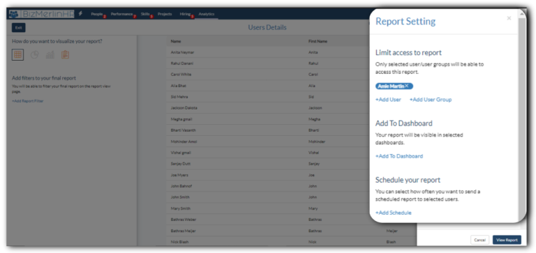
- Then, “Proceed to report settings”. In which you can “add user” or “a user group” who will be able to access this report.
- Furthermore, you can categorize your report under a particular dashboard by clicking on “Add To Dashboard” or You can select how often you want to send a “Scheduled report” to selected users.
- On the “Report view page”, you can see your final report.